Q&A 39 How do you visualize the relationship between two numerical variables using a scatter plot?
39.1 Explanation
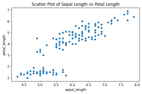
A scatter plot displays the relationship between two continuous variables. Each point represents an observation, with its position defined by the values of two numeric features.
- Helps detect linear or nonlinear trends
- Reveals outliers or clusters
- Useful for checking correlation
This is often a starting point for exploring predictor-response relationships in regression or feature selection tasks.
39.2 Python Code
import pandas as pd
import seaborn as sns
import matplotlib.pyplot as plt

# Load the iris dataset
df = pd.read_csv("data/iris.csv")

# Basic scatter plot: sepal_length vs petal_length
plt.figure(figsize=(6, 4))
sns.scatterplot(data=df, x="sepal_length", y="petal_length")
plt.title("Scatter Plot of Sepal Length vs Petal Length")
plt.tight_layout()
plt.show()