Q&A 29 How do you use ridge plots to compare distributions across a categorical variable?
29.1 Explanation
Ridge plots (also called joy plots) stack density plots for different categories along a shared axis. This creates an overlapping or cascading view of how a numerical variable is distributed across levels of a categorical variable.
Ridge plots are useful when: - You want to compare distribution shapes across many groups - Detecting overlap, skew, or separation - You want a compact, informative layout
They are most effective when the number of categories is moderate (3–10), and require additional libraries like seaborn and plotnine in Python or ggridges in R.
29.2 Python Code
# ✅ Load libraries
import pandas as pd
import seaborn as sns
import matplotlib.pyplot as plt

# Load dataset
df = pd.read_csv("data/iris.csv")

# Ridge-style plot using seaborn's KDE for each species
plt.figure(figsize=(8, 6))
for species in df["species"].unique():
    subset = df[df["species"] == species]
    sns.kdeplot(
        data=subset,
        x="sepal_length",
        fill=True,
        label=species,
        alpha=0.5
    )

plt.title("Ridge Plot: Sepal Length Distributions by Species")
plt.xlabel("Sepal Length")
plt.legend(title="Species")
plt.tight_layout()
plt.show()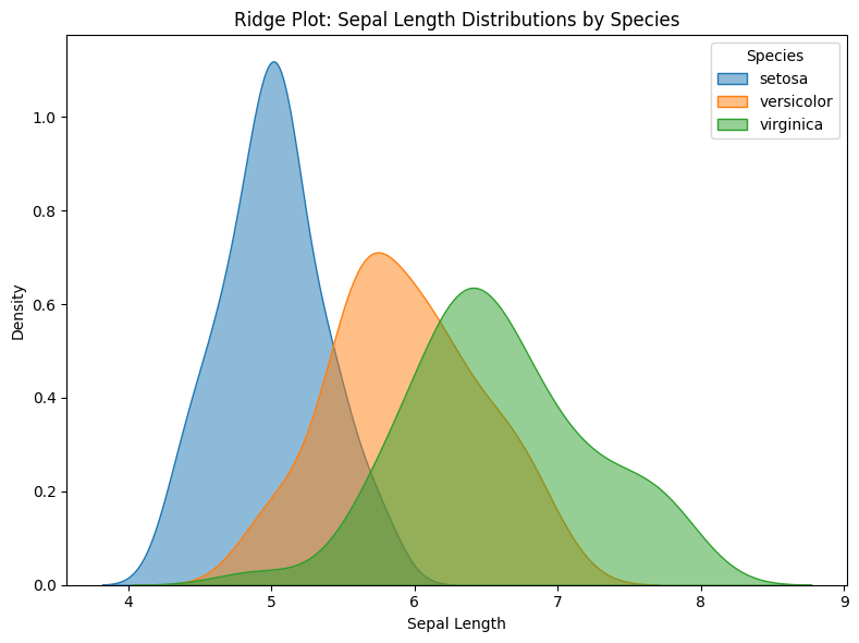
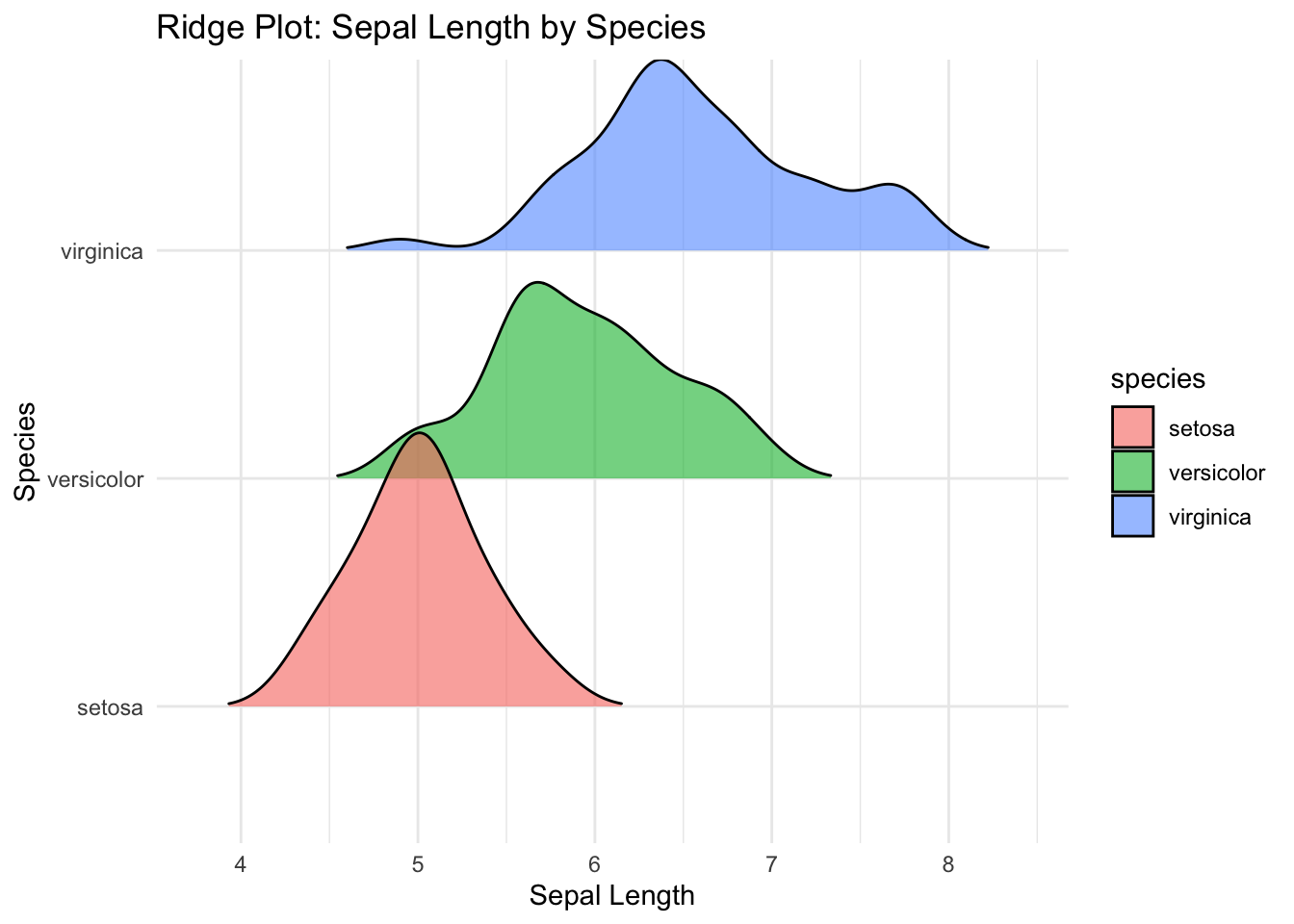
29.3 R Code
# ✅ Load libraries
library(tidyverse)
library(ggridges)

# Load dataset
df <- read_csv("data/iris.csv", show_col_types = FALSE)

# Ridge plot: Sepal length distribution by species
ggplot(df, aes(x = sepal_length, y = species, fill = species)) +
  geom_density_ridges(alpha = 0.6, scale = 1.2, rel_min_height = 0.01) +
  labs(title = "Ridge Plot: Sepal Length by Species",
       x = "Sepal Length", y = "Species") +
  theme_minimal()