Q&A 33 How do you visualize group summaries using bar plots with error bars?
33.1 Explanation
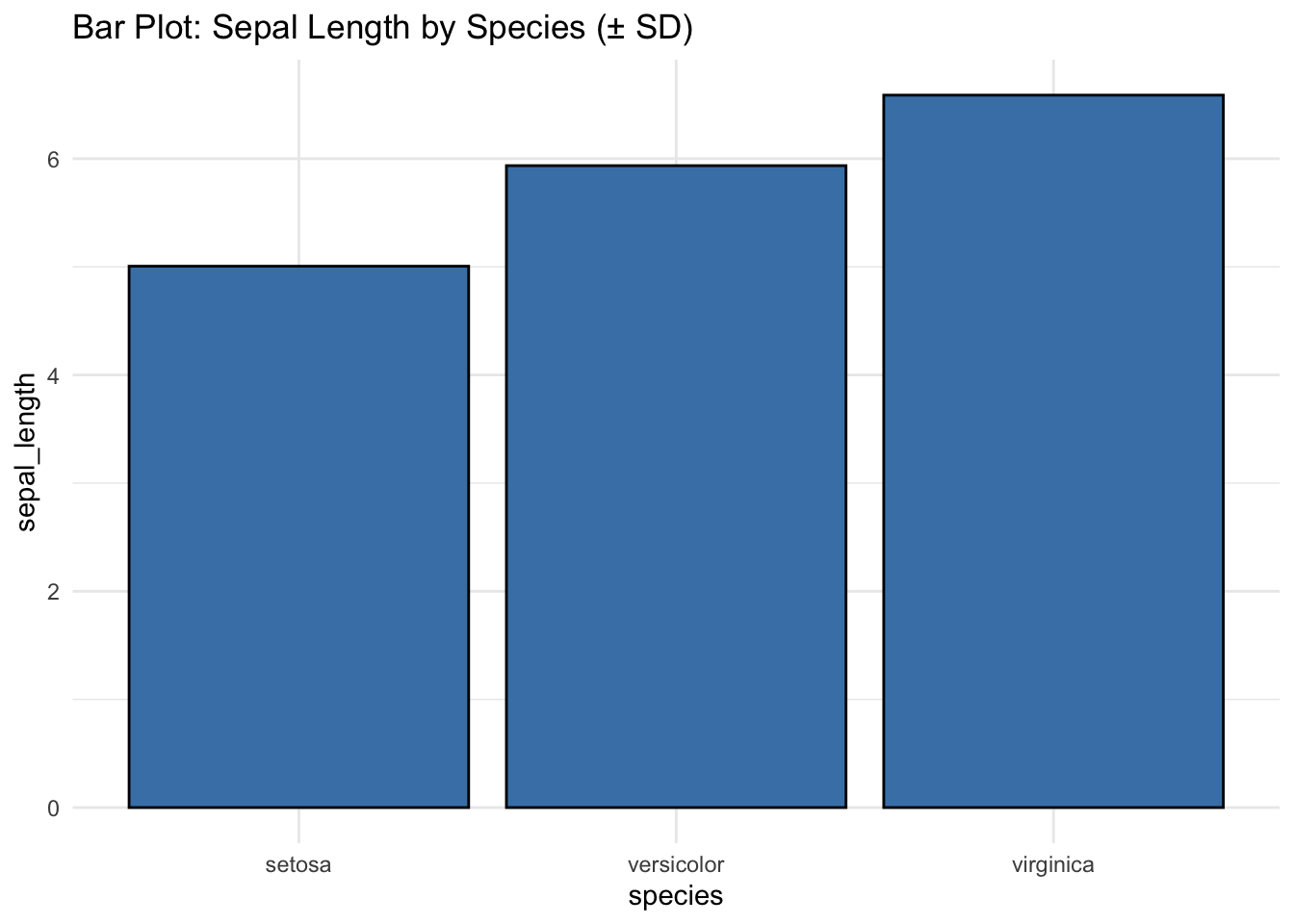
Bar plots with error bars summarize numeric values for each category and include visual indicators of variability (like standard deviation or confidence intervals). This helps compare group means along with their uncertainty.
- Common in scientific publications and business reporting
- Ideal for highlighting average differences between groups
- Error bars indicate precision and variability in group estimates
Use cases: - Comparing mean values across groups - Reporting experiment outcomes or aggregated survey responses
33.2 Python Code
import pandas as pd
import seaborn as sns
import matplotlib.pyplot as plt

# Load dataset
df = pd.read_csv("data/iris.csv")

# Add dummy hue column to suppress palette warning
df["hue"] = df["species"]

# Bar plot with standard deviation error bars
plt.figure(figsize=(6, 4))
sns.barplot(
    data=df,
    x="species",
    y="sepal_length",
    hue="hue",  # assign dummy hue to allow palette
    errorbar="sd",
    capsize=0.1,
    palette="Blues",
    legend=False
)
plt.title("Bar Plot: Sepal Length by Species (± SD)")
plt.tight_layout()
plt.show()
33.3 R Code
library(ggplot2)
library(readr)
df <- read_csv("data/iris.csv")

# Bar plot using stat_summary
ggplot(df, aes(x = species, y = sepal_length)) +
  stat_summary(fun = mean, geom = "bar", fill = "steelblue", color = "black") +
  stat_summary(fun.data = mean_sdl, fun.args = list(mult = 1),
               geom = "errorbar", width = 0.2) +
  labs(title = "Bar Plot: Sepal Length by Species (± SD)") +
  theme_minimal()