Q&A 34 How do you visualize relationships between two numerical variables using a scatter plot?
34.1 Explanation
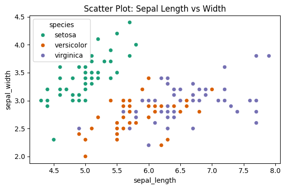
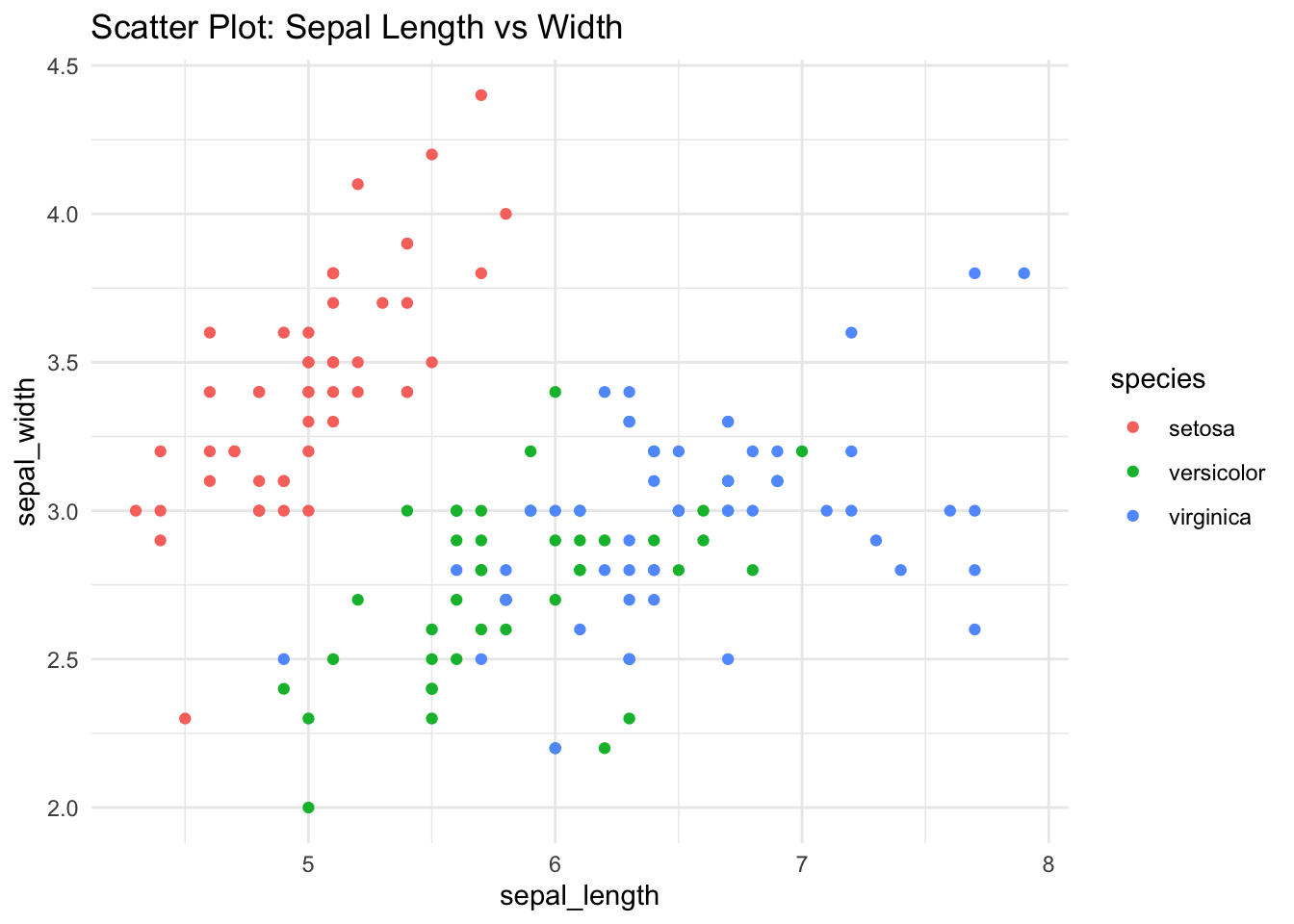
A scatter plot visualizes the relationship between two continuous numerical variables. Each point represents an observation, with its position determined by the two variables.
- Ideal for spotting correlations, clusters, and outliers
- Best suited for continuous, paired variables (e.g., sepal width vs sepal length)
- Can be colored by a categorical variable (like species) to highlight group separation
34.2 Python Code
import pandas as pd
import seaborn as sns
import matplotlib.pyplot as plt

df = pd.read_csv("data/iris.csv")

# Scatter plot with species-based coloring
plt.figure(figsize=(6, 4))
sns.scatterplot(data=df, x="sepal_length", y="sepal_width", hue="species", palette="Dark2")
plt.title("Scatter Plot: Sepal Length vs Width")
plt.tight_layout()
plt.show()