Q&A 41 How do you visualize simple proportions using a pie chart?
41.1 Explanation
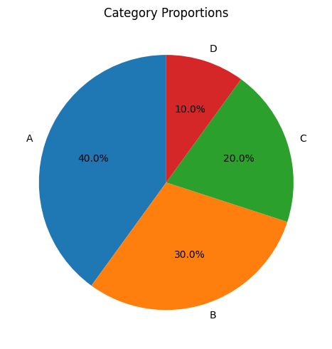
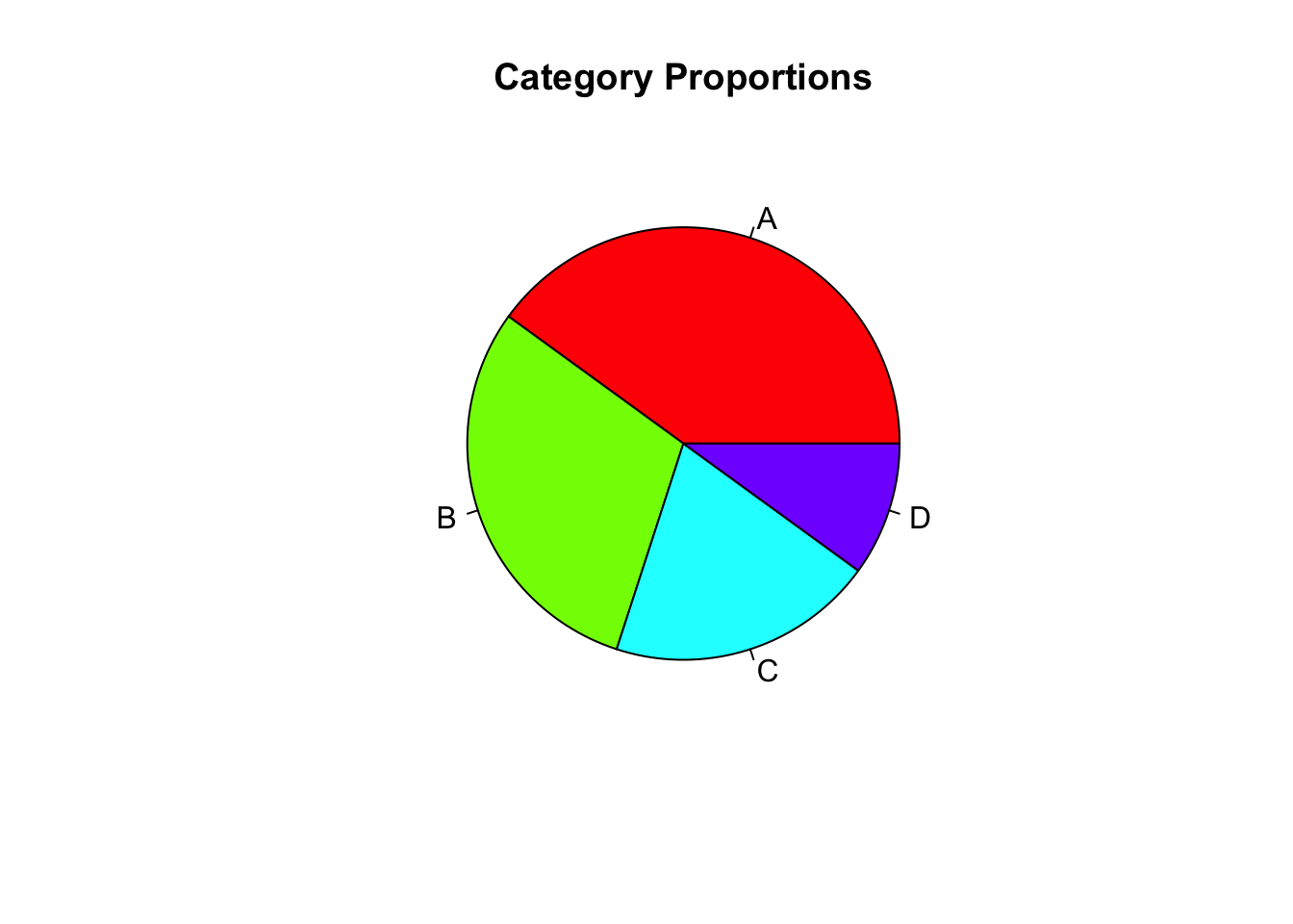
A pie chart represents parts of a whole as slices of a circle. Each slice’s size is proportional to its value, making it easy to visualize category proportions at a glance.
- Best used when comparing a small number of categories (≤5)
- Labels or percentages should be clearly shown
- Not ideal for precise comparisons — bar charts are usually better
Use pie charts in: - Survey responses (e.g., favorite colors, device usage) - Market share or budget composition - Simple storytelling visuals
41.2 Python Code
import pandas as pd
import matplotlib.pyplot as plt

# Sample data
data = pd.Series([40, 30, 20, 10], index=["A", "B", "C", "D"])

# Create pie chart
plt.figure(figsize=(5, 5))
data.plot.pie(autopct='%1.1f%%', startangle=90)
plt.title("Category Proportions")
plt.ylabel("")  # Hide y-axis label
plt.tight_layout()
plt.show()