Q&A 25 How do you visualize smooth distributions using density plots?
25.1 Explanation
A density plot estimates the probability distribution of a numeric variable using a smoothed curve. Unlike histograms, it doesn’t rely on fixed bins and provides a clearer sense of:
- Skewness or symmetry
- Peaks (modes) and valleys
- Overlapping distributions (when grouped)
Density plots are especially useful for comparing multiple groups with minimal visual clutter.
25.2 Python Code
import pandas as pd
import seaborn as sns
import matplotlib.pyplot as plt

# Load dataset
df = pd.read_csv("data/iris.csv")

# Plot density of sepal length
plt.figure(figsize=(6, 4))
sns.kdeplot(df["sepal_length"], fill=True, color="purple", alpha=0.5)
plt.title("Density Plot of Sepal Length")
plt.xlabel("Sepal Length (cm)")
plt.ylabel("Density")
plt.tight_layout()
plt.show()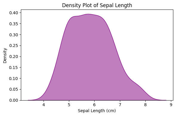
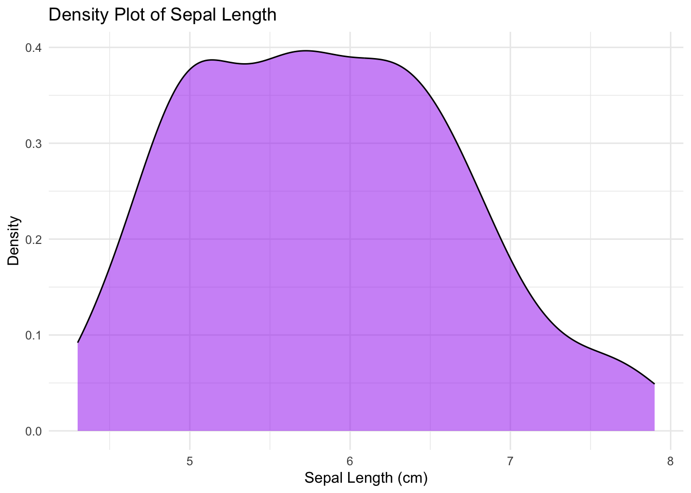
25.3 R Code
library(ggplot2)
library(readr)

# Load dataset
df <- read_csv("data/iris.csv", show_col_types = FALSE)

# Plot density
ggplot(df, aes(x = sepal_length)) +
  geom_density(fill = "purple", alpha = 0.5) +
  labs(title = "Density Plot of Sepal Length",
       x = "Sepal Length (cm)", y = "Density") +
  theme_minimal()