Q&A 32 How do you visualize group summaries using a dot plot?
32.1 Explanation
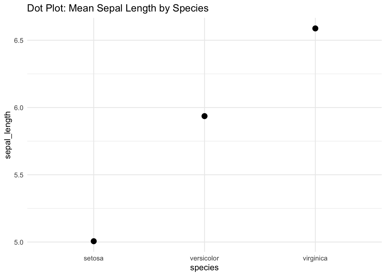
A dot plot summarizes group-level statistics using dots to represent values like means or medians. It can also include error bars to show variability (e.g., standard deviation, confidence intervals).
- Useful for comparing group summaries
- Less cluttered than full distributions
- Often used in scientific plots or when sample size is large
Dot plots emphasize: - Central tendency (mean or median) - Uncertainty or variation (via error bars)
32.2 Python Code
import pandas as pd
import seaborn as sns
import matplotlib.pyplot as plt

# Load data
df = pd.read_csv("data/iris.csv")

# Create the dot plot using pointplot
plt.figure(figsize=(6, 4))
sns.pointplot(data=df, x="species", y="sepal_length", errorbar="sd", capsize=0.1)
plt.title("Dot Plot: Mean Sepal Length by Species")
plt.tight_layout()
plt.show()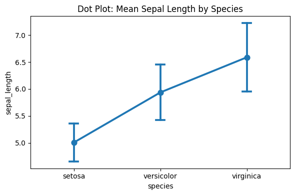
32.3 R Code
library(ggplot2)
library(readr)
df <- read_csv("data/iris.csv")

# Dot plot using stat_summary for mean ± SD
ggplot(df, aes(x = species, y = sepal_length)) +
  stat_summary(fun = mean, geom = "point", size = 3) +
  stat_summary(fun.data = mean_sdl, fun.args = list(mult = 1),
               geom = "errorbar", width = 0.2) +
  labs(title = "Dot Plot: Mean Sepal Length by Species") +
  theme_minimal()