Q&A 28 How do you use violin plots to compare groups across a categorical variable?
28.1 Explanation
Violin plots combine the summary statistics of boxplots with the distribution shape provided by kernel density estimation. They show:
- The median and interquartile range (like a boxplot)
- A smooth curve representing the data distribution
- Symmetry, skewness, and modality within each group
Violin plots are especially useful when: - You want to see if distributions are symmetric or skewed - Comparing more than two groups - Spotting multi-modal patterns (multiple peaks)
28.2 Python Code
# ✅ Load libraries
import pandas as pd
import seaborn as sns
import matplotlib.pyplot as plt

# Load dataset
df = pd.read_csv("data/iris.csv")

# Violin plot: Sepal length by species (future-proof)
plt.figure(figsize=(6, 5))
sns.violinplot(
    data=df,
    x="species",
    y="sepal_length",
    hue="species",               # <-- assign hue to avoid the FutureWarning
    palette="viridis",
    legend=False                 # <-- hide duplicate legend
)
plt.title("Violin Plot: Sepal Length by Species")
plt.xlabel("Species")
plt.ylabel("Sepal Length")
plt.tight_layout()
plt.show()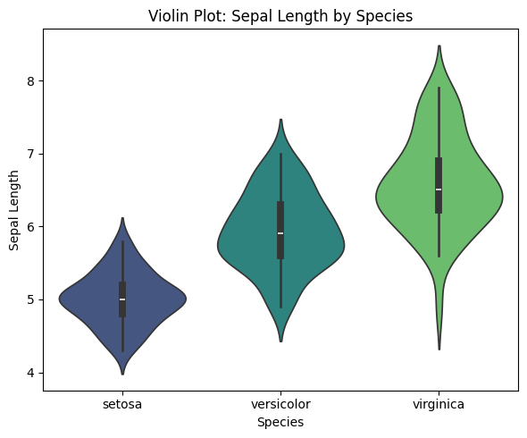
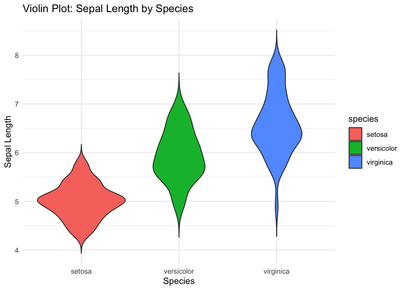
28.3 R Code
# ✅ Load libraries
library(tidyverse)

# Load dataset
df <- read_csv("data/iris.csv", show_col_types = FALSE)

# Violin plot: Sepal length by species
ggplot(df, aes(x = species, y = sepal_length, fill = species)) +
  geom_violin(trim = FALSE) +
  labs(title = "Violin Plot: Sepal Length by Species", x = "Species", y = "Sepal Length") +
  theme_minimal()