Q&A 22 How do you visualize the frequency of categorical variables?
22.1 Explanation
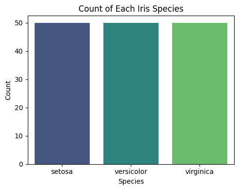
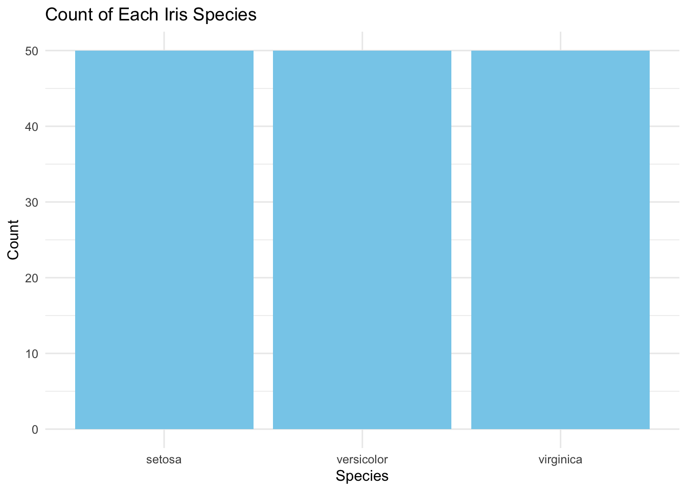
A bar plot displays the frequency (or proportion) of each category. It’s the most straightforward way to understand how data is distributed across different groups or labels.
Use bar plots to: - Explore class imbalance - Profile survey responses or demographic data - Prepare categorical variables for modeling or encoding
22.2 Python Code
import pandas as pd
import seaborn as sns
import matplotlib.pyplot as plt

# Load dataset
df = pd.read_csv("data/iris.csv")

# Fix: Assign 'species' to both x and hue, set legend=False
plt.figure(figsize=(5, 4))
sns.countplot(data=df, x="species", hue="species", palette="viridis", legend=False)
plt.title("Count of Each Iris Species")
plt.xlabel("Species")
plt.ylabel("Count")
plt.tight_layout()
plt.show()