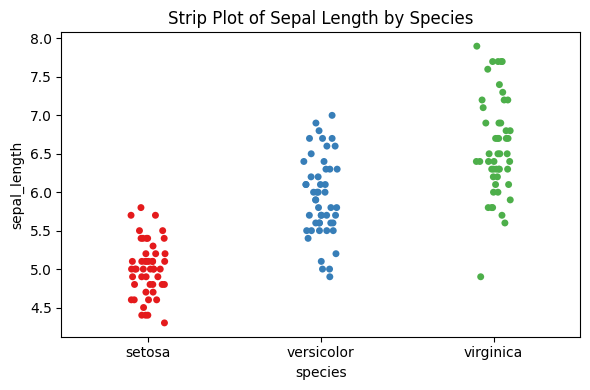
Q&A 30 How do you visualize individual data points by group using a strip plot?
30.1 Explanation
Strip plots display each individual data point along a category axis. They are useful for small datasets where you want to:
- See the raw data instead of aggregated summaries
- Detect overlaps or clusters
- Optionally use jittering to reduce overlap and improve readability
Strip plots are ideal when used alongside boxplots or violin plots for added context.
30.2 Python Code
import seaborn as sns
import pandas as pd
import matplotlib.pyplot as plt

# Load iris dataset
df = pd.read_csv("data/iris.csv")

# Convert species to categorical if needed
df["species"] = df["species"].astype("category")

# Strip plot with fixed warning
plt.figure(figsize=(6, 4))
sns.stripplot(data=df, x="species", y="sepal_length", hue="species",
              jitter=True, palette="Set1", legend=False)
plt.title("Strip Plot of Sepal Length by Species")
plt.tight_layout()
plt.show()