Q&A 40 How do you enhance scatter plots by adding group color and trend lines?
40.1 Explanation
To better understand patterns, we can enhance scatter plots by:
- Coloring by category (e.g., species) using the hue/color aesthetic
- Adding trend lines (e.g., linear regression) to highlight the relationship
- Faceting to compare subgroups if needed
These enhancements make it easier to detect group separation, cluster behavior, and correlation patterns.
40.2 Python Code
import pandas as pd
import seaborn as sns
import matplotlib.pyplot as plt

# Load dataset
df = pd.read_csv("data/iris.csv")

# Enhanced scatter plot with hue and trend line
plt.figure(figsize=(7, 5))
sns.lmplot(data=df, x="sepal_length", y="petal_length", hue="species",
           height=5, aspect=1.2, markers=["o", "s", "D"])
plt.title("Enhanced Scatter Plot with Species Hue and Trend Lines")
plt.tight_layout()
plt.show()
<Figure size 700x500 with 0 Axes>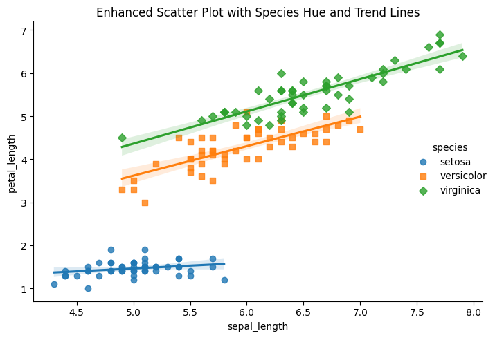
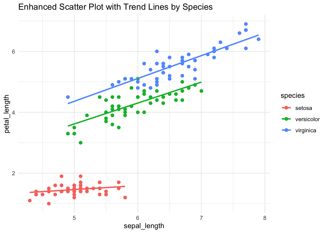
40.3 R Code
library(ggplot2)
library(readr)

# Load dataset
df <- read_csv("data/iris.csv")

# Enhanced scatter plot with color and smoothing line
ggplot(df, aes(x = sepal_length, y = petal_length, color = species)) +
  geom_point(size = 2) +
  geom_smooth(method = "lm", se = FALSE) +
  labs(title = "Enhanced Scatter Plot with Trend Lines by Species") +
  theme_minimal()