Q&A 38 How do you visualize correlation between numerical variables?
38.1 Explanation
A correlation heatmap provides a quick overview of linear relationships between numerical variables in a dataset. It helps:
- Identify strong correlations (positive or negative)
- Detect multicollinearity for modeling
- Choose appropriate features for further analysis
The correlation values range from –1 to +1: - +1: perfect positive correlation - –1: perfect negative correlation - 0: no linear relationship
Heatmaps display these values with color intensity and optional labels.
38.2 Python Code
import pandas as pd
import seaborn as sns
import matplotlib.pyplot as plt

# Load dataset
df = pd.read_csv("data/iris.csv")

# Compute correlation matrix (numeric columns only)
corr = df.select_dtypes(include="number").corr()

# Set figure size and plot
plt.figure(figsize=(6, 5))
sns.heatmap(corr, annot=True, cmap="coolwarm", fmt=".2f", square=True,
            linewidths=0.5, cbar_kws={"shrink": 0.8})

# Customize plot
plt.title("Correlation Heatmap")
plt.tight_layout()
plt.show()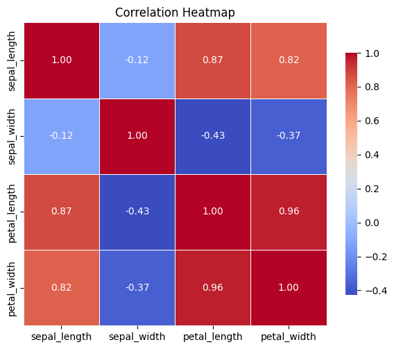
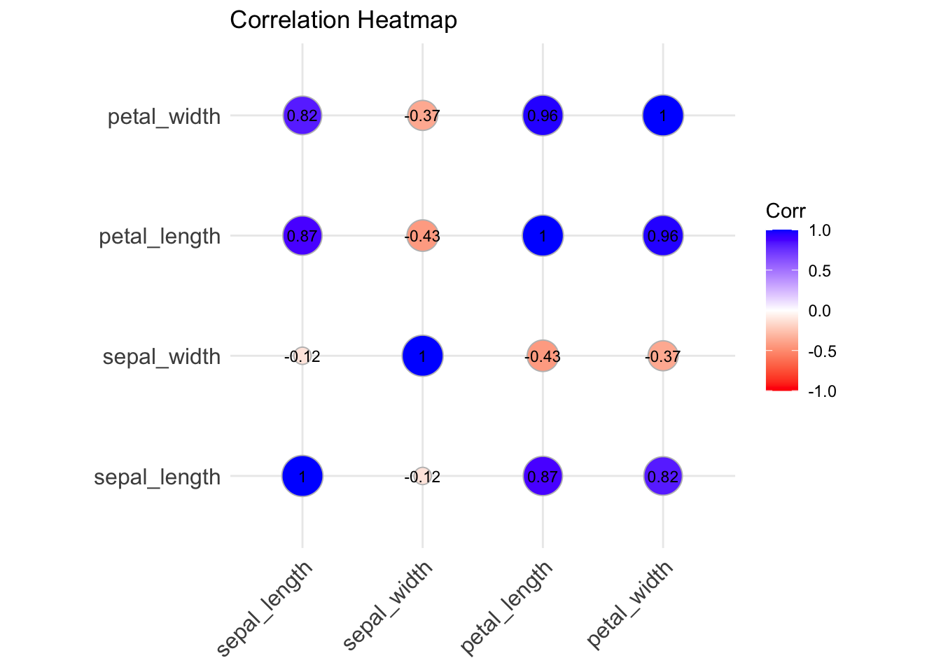
38.3 R Code
library(readr)
library(ggcorrplot)

# Load dataset
df <- read_csv("data/iris.csv")

# Compute correlation matrix (numeric columns)
corr <- cor(df[1:4])

# Plot correlation heatmap
ggcorrplot(corr, method = "circle", lab = TRUE, lab_size = 3,
           colors = c("red", "white", "blue"),
           title = "Correlation Heatmap", ggtheme = ggplot2::theme_minimal())