Q&A 27 How do you use boxplots to compare groups across a categorical variable?
27.1 Explanation
Boxplots are ideal for visualizing the distribution of a numerical variable across groups. Each box shows the median, interquartile range (IQR), and potential outliers.
They help answer questions like: - Are group medians different? - Is one group more variable than others? - Are there any outliers?
Boxplots are most effective when comparing a few groups and when you’re interested in summary statistics.
27.2 Python Code
# ✅ Load libraries
import pandas as pd
import seaborn as sns
import matplotlib.pyplot as plt

# Load dataset
df = pd.read_csv("data/iris.csv")

# Boxplot: Sepal length by species
plt.figure(figsize=(6, 5))
sns.boxplot(data=df, x="species", y="sepal_length", palette="viridis", hue="species", legend=False)
plt.title("Sepal Length by Species")
plt.xlabel("Species")
plt.ylabel("Sepal Length")
plt.legend([], [], frameon=False)  # Suppress duplicate legend
plt.tight_layout()
plt.show()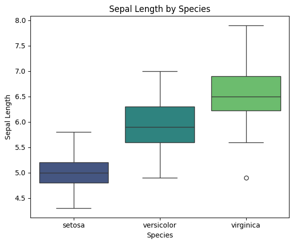
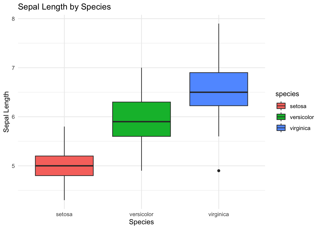
27.3 R Code
# ✅ Load libraries
library(tidyverse)

# Load dataset
df <- read_csv("data/iris.csv", show_col_types = FALSE)

# Boxplot: Sepal length by species
ggplot(df, aes(x = species, y = sepal_length, fill = species)) +
  geom_boxplot() +
  labs(title = "Sepal Length by Species", x = "Species", y = "Sepal Length") +
  theme_minimal()