Q&A 37 How do you visualize all pairwise relationships using a pair plot?
37.1 Explanation
A pair plot (also known as a scatterplot matrix) displays scatter plots for every pair of numerical variables in a dataset. The diagonal often shows variable distributions using histograms or density plots.
This visualization helps you:
- Explore correlations and interactions between features
- Detect group clustering, separation, or non-linear trends
- Identify outliers or unusual combinations of values
- Visually assess distributions alongside pairwise relationships
Coloring points by a categorical variable (e.g., species) enhances insight into group patterns and separability.
37.2 Python Code
import pandas as pd
import seaborn as sns
import matplotlib.pyplot as plt
# Load the iris dataset
df = pd.read_csv("data/iris.csv")
# --- Pair Plot 1: KDE on diagonal, full matrix ---
sns.pairplot(df, hue="species", palette="husl", diag_kind="kde")
plt.suptitle("Pair Plot of Iris Features (KDE on Diagonals)", y=1.02)
plt.tight_layout()
plt.show()
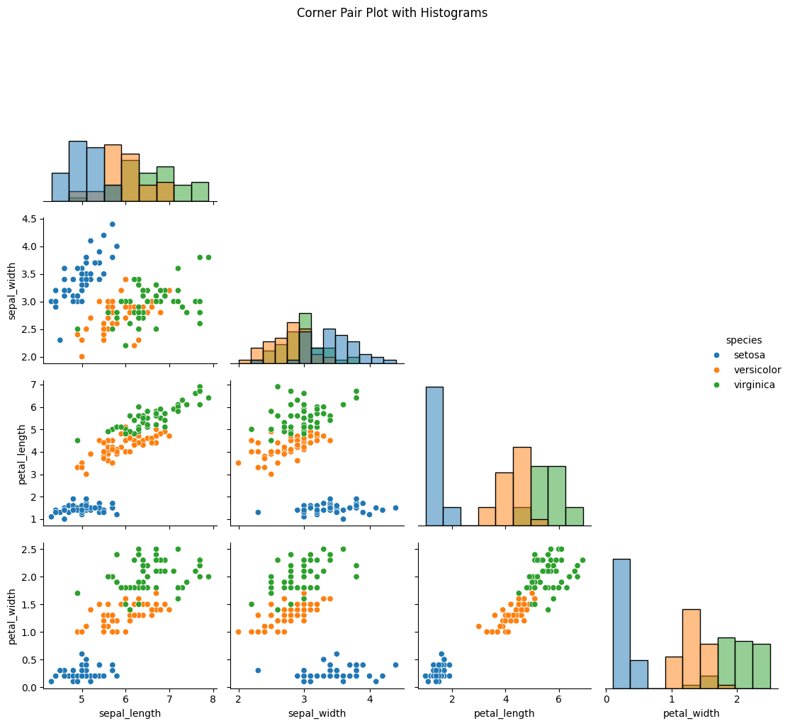
# --- Pair Plot 2: Histogram on diagonal, corner only ---
sns.pairplot(df, hue="species", diag_kind="hist", corner=True)
plt.suptitle("Corner Pair Plot with Histograms", y=1.02)
plt.tight_layout()
plt.show()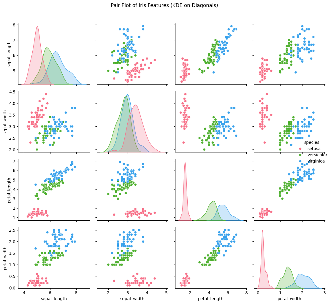
37.3 R Code
## R Code
# Load libraries
library(GGally)
library(ggplot2)
library(dplyr)
library(readr)

# Load iris dataset
df <- read_csv("data/iris.csv")
df$species <- as.factor(df$species)

# --- Pair Plot 1: Full matrix with density on diagonals ---
ggpairs(df, aes(color = species, fill = species),
        upper = list(continuous = wrap("points", alpha = 0.7)),
        lower = list(continuous = wrap("points", alpha = 0.7)),
        diag = list(continuous = wrap("densityDiag", alpha = 0.4))) +
  theme_minimal() +
  ggtitle("Pair Plot of Iris Features (Density on Diagonals)")
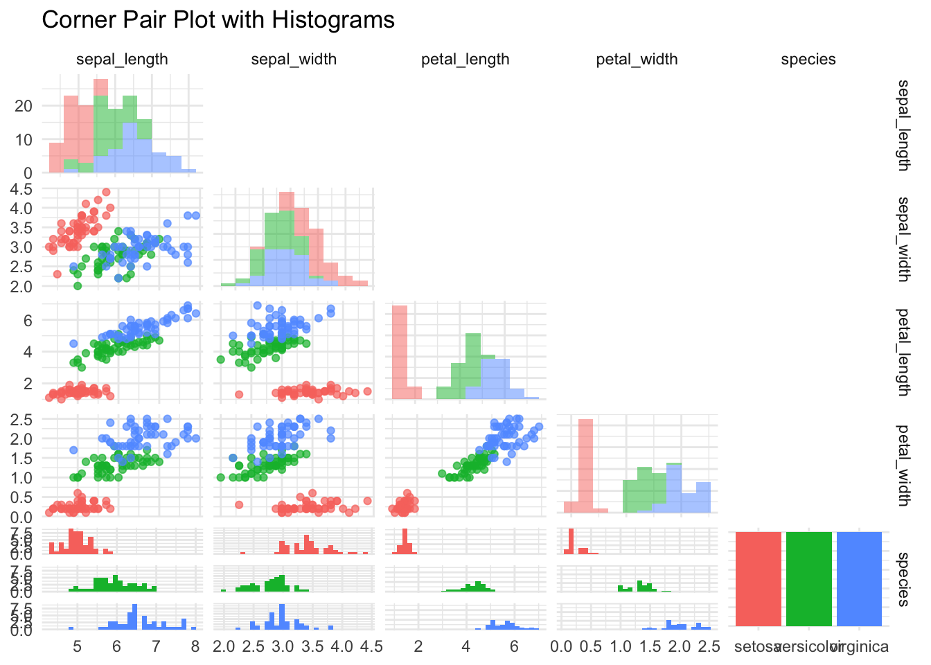
# --- Pair Plot 2: Lower triangle only with histograms on diagonal ---
ggpairs(df, aes(color = species),
        upper = "blank",
        lower = list(continuous = wrap("points", alpha = 0.7)),
        diag = list(continuous = wrap("barDiag", bins = 10, alpha = 0.5))) +
  theme_minimal() +
  ggtitle("Corner Pair Plot with Histograms")